Traverse City’s beloved railroad-themed brewery and eatery asked for an update to their logo as part of an initiative to can and label their beer. Full disclosure: they had received a concept for a new logo from another designer but were ready to have me rework that concept to better reflect their brand.
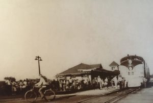
I found my solution in an old photo hanging inside. The old diesel train that brought visitors to Traverse City had a certain iconic look that worked as a logo mark.
Below is the finished logo art for use on their cans. I’m not certain if this will be part of a new brand initiative or not, but I certainly hope so. Note that they use “The Filling Station” and simply “Filling Station” interchangeably.