This redesign of Right Brain Brewery’s logo and overarching brand was done in 2012 in collaboration with graphic designer Maria Kinney. The result included a circular mark filled with custom type.
I designed several different concepts, but the final approved version of their new logo was one that included my handwriting. I also included a font that conveyed this style. We would eventually add a variant that used a circular tagline and location around the core logo as well.
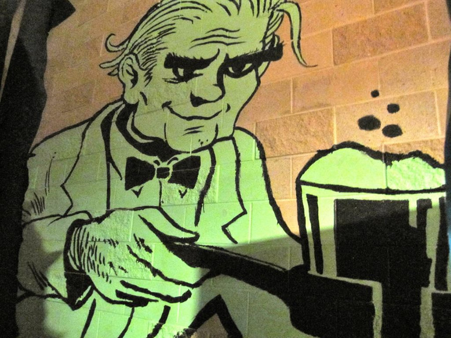
In addition to the logo itself, we provided a set of images that suggested an overarching brand aesthetic. Maria Kinney insisted that there be a mad scientist whereas I contributed some pulp sci-fi images and a few animals. We included all kinds of things that seemed to represent exploration and fun. These images provided inspiration for labels and other materials that would come later.

I wasn’t sure if any of those illustrations would be used but I was very happy when some of them were. As the brand continued to evolve, I was able to contribute more and more of my work to the cause. I’m proud that the work I did with RBB represented a genuine part of my own style. I didn’t have to hold back the weird and quirky side of myself.
Although the initial style guide included an “official” set of colors and other guidelines, I’m happy that these were ultimately replaced by a general sensibility rather than firm rules. It wasn’t overly random but the playfulness better reflected the creativity and offhandedness of the brand and their brewing style. The logo appeared in many different colors depending on the context, and typography varied in the same way.

I can’t tell you how satisfying it was to see my artwork used to define this phase of their branding. It was a defining moment in my career and one that helped me build confidence in my work. Click here to see more work I did with RBB.